Market Analysis

Murrysville 2022 Market in Review

The year 2022 was a year of historically low inventory and high demand, unlike anything Murrysville has seen in recent history. Interest rates have been a major player in the market this year and definitely caused some of the historic gains to cool off towards the last quarter of the year. As rates rose, activity slowed- at least to a certain extent. As you look through this report, you will notice that the rise in mortgage rates corresponds to other market data events.

The annual median home sales price rose from $330,000 in 2021 to $374,100 in 2022 which is a 13.4% increase. Compare that to the year 2020 when the median sale price was $300,000 and the increase was at 10%.  In looking to this coming year, it is safe to say that these increases will cool down. To what degree will depend on mortgage interest rates, inflation, demand and market saturation.

The general trend in the median sale price over the past year has been increasing with the peaks in those increases showing up during the summer months.

The supply has been historically very low in 2022 and this chart shows that there was a build up right around April. It is typically between March and April that sellers list their properties in anticipation of the height of the buying season.

The marketing times (expressed in DOM- days on market) has also been extremely low. However, in the past few months, this has been rising due to a cooling in the market most likely attributed to seasonal cyclical events during winter months and compounded by the rising mortgage rates. A rise in marketing times should be viewed as a possible indicator that listing prices are at a peak point and/or demand is starting to balance.

As is expected, the quantity of sales is most active in the months May through September.

The current number of active listings is also decreasing. We will have to wait to see if this starts to increase when the market typically experiences seasonal cyclical events around March or April when sellers like to place their properties on the market.

Not only as demonstrated in the previous chart which showed the number of actives decreasing, the median list price is also decreasing. This could be significant to keep in mind. As the marketing times increase and the list prices decrease, this could have a direct impact on the median sale price going forward. Only time will tell how all of this will affect 2023 sales.


Greensburg 2022 Market in Review

The year 2022 was a year of historically low inventory and high demand, unlike anything Greensburg has seen in recent history. Interest rates have been a major player in the market this year and definitely caused some of the historic gains to cool off towards the last quarter of the year. As rates rose, activity slowed- at least to a certain extent. As you look through this report, you will notice that the rise in mortgage rates corresponds to other market data events.

 The annual median home sales price for all residential properties in Greensburg rose from $149,950 in 2021 to $173,450 in 2022 which is a 15.7% increase. Compare that to the year 2020 when the median sale price was $135,000 and the increase was at 11.1%.  In looking to this coming year, it is safe to say that these increases will cool down. To what degree will depend on mortgage interest rates, inflation, demand and market saturation.

The general trend in the median sale price over the past year has been increasing with the peaks in those increases showing up during the summer months.

The supply has been historically very low in 2022. The supply appears to have had a sharp increase towards the end of the year which is counter intuitive to cyclical seasonal historical data.

The marketing times (expressed in DOM- days on market) has also been extremely low. However, in the past few months, this has been rising due to a cooling in the market most likely attributed to seasonal cyclical events during winter months and compounded by the rising mortgage rates.

As is expected, the quantity of sales decreased in the last quarter of the year.

One point of data I was surprised to see pertains to the actual number of transactions year over year for the last 3 years. The years 2020 and 2021 had a high number of transactions with 2022 showing a slight drop off. This is conversely affected by the fact that with fewer transactions, there was a higher median sale price.  

The current number of active listings is also decreasing. We will have to wait a few months to see if this starts to increase when the market typically experiences seasonal cyclical events around March or April when sellers like to place their properties on the market.

Not only as demonstrated in the previous chart which showed the number of actives decreasing, the median list price is also decreasing. This could be significant to keep in mind. As the marketing times increase and the list prices decrease, this could have a direct impact on the median sale price going forward. Only time will tell how all of this will affect 2023 sales.

Times Are A-Changin'

Over the past couple months, there has been a shift in the market here in the Greensburg area of Westmoreland County. These changes are being affected by multiple factors such as the seasonal time of year that typically impacts real estate, the rise in interest rates and the need for the market to correct itself from the heightened activity over the past year. This shift was so pronounced in a recent appraisal I completed that I had to share it with you. Below is a graph that was taken from a work file for a property I have recently appraised. This is real time data. When you take a look at this graph, it clearly shows that the supply in the market has made a rapid rise within the past month and is starting to equal the Summer of 2020 and pre-Covid levels.

You might ask, “What does this mean?”. Well, I don’t have a crystal ball and am not in the business of being an economic forecaster- so the immediate answer is “I don’t know yet”. Only time will tell. However, just like the leaves are changing color indicating changes are coming, real estate data is starting to tell us that changes are possibly coming in the near future.

Keep updated with my blog. As soon as I have more information to pass along regarding marketing trends, I will pass it along to you.

Murrysville 2022 Quarter 1

It was bound to happen. The signs are pointing to a cooling off from the height of increases we experienced in 2021. While there is still a short supply, this supply is starting to increase. As of this writing on May 23, 2022 there were 84 sales in Murrysville since the first of the year and currently there are 24 active listings, 43 properties with contingent contracts and 17 properties under contract.

2022 Quarter 1 Sales

According to the data, the first quarter of sales in 2022 for Murrysville has shown a decrease in the predominant sale prices of 2.5% per month based on simple regression. This is different from the first quarter of 2021 which was experiencing an increase of 5.6% per month.

2021 Quarter 1 Sales

I don’t have the ability to forecast what will happen in the future and we are entering the cyclical time of year when sales typically are at their strongest. However, the start of this year is possibly showing that prices are starting to correct from the highs and increases posted by 2021 and the balance is starting to tip in favor of more of a balance.

Murrysville Year 2021 in Review

Last year, I relocated my business to Murrysville. It has been a pleasure to provide residential valuation services in an area that has so much to offer. As many have heard, read or experienced, the real estate market in the year 2021 was crazy. Houses would go up for sale and within a very short period of time, sometimes hours, multiple offers were received. Buyers were getting very aggressive with their offers, electing to forego all inspections, include escalation clauses and even include things such as free pizza dinners on Fridays for a year or Super Bowl tickets.

I decided to run the numbers on Murrysville as a whole and found that in the year 2021 there were a total of 267 recorded sales using a search of our local multiple listing service. These numbers do not include foreclosures or short sales. As an appraiser, we analyze what is going on in the market area. When doing this, we have to look at both the long term and short term activity in order to be able to recognize when there are changes happening in the market and how to best determine how this impacts value.

Murrysville Year 2021 Real Estate Sales Statistics

If you look at the general statistics of the area as a whole using simple regression, this shows that the year in review experienced a rising predominant sales price of about 1.3% per month.

Murrysville, 2021 Qtr 1

The moment you break down the sales prices into quarters, there are some very interesting results. The first quarter of the year had 59 sales which was the least number of transactions per quarter but was the only quarter that experienced an increase in predominant sales prices. Seasonally, the first and fourth quarters typically are the times of year with the least number of transactions, however, there were not the significant differences that we would typically find between the quarters. Quarter 2 had 78 sales, quarter 3 had 63 sales and the last quarter had 65 sales. More surprising is that the remaining 3 quarters experienced declines in the predominant sales prices.

Murrysville, 2021 Qtr 2

Murrysville, 2021 Qtr 3

Murrysville, 2021 Qtr 4

It is important to know that when determining the impact of what is going on in the market, statistics need to be analyzed specific to the area and specific to the time frame being impacted. Quarter 1 experienced a very significant increase in sales prices, quarter 2 was basically flat, quarter 3 had a reverse reaction by a notable decline with another decline in the 4th quarter but not as significant as the previous quarter.

The good news is that the declines of the last 2 quarters did not erase the overall trend of an increase from the beginning of the year. However, the last 2 quarters show that there could be a definite trend that is showing a cooling off and decline in the predominant sales prices.

Market Data Analysis: Weird Influences

This home is 20 minutes from our office. No problems… right? One of the most difficult things to determine the impact on marketability of is odd influences. The home above looks like a typical home in much of the greater Pittsburgh area - an older s…

This home is 20 minutes from our office. No problems… right? One of the most difficult things to determine the impact on marketability of is odd influences. The home above looks like a typical home in much of the greater Pittsburgh area - an older structure, with need of some repairs and a sloped yard. That’s relatively easy to find comparables for.

Ok, now we have an issue. Those are high tension power lines very close to the right side of the home. We’re going to need to determine the influence on value of that, but that’s not the only home in the area with that influence… this will be fine. …

Ok, now we have an issue. Those are high tension power lines very close to the right side of the home. We’re going to need to determine the influence on value of that, but that’s not the only home in the area with that influence… this will be fine. We can take homes that are built near power lines and similar homes that are not and compare the market reaction to determine the impact (paired sales analysis).

Wait…. they built the house between high tension powerlines, not next to. Now we have extra questions that we have to answer, 1) Can this structure legally be rebuilt if destroyed? 2) Do you get super powers if you live there long enough? 3) We woul…

Wait…. they built the house between high tension powerlines, not next to. Now we have extra questions that we have to answer, 1) Can this structure legally be rebuilt if destroyed? 2) Do you get super powers if you live there long enough? 3) We would need to call real estate professionals for their opinion of what impact this could have (ie. What percent of the buyer pool would never consider this home? Of those remaining, what kind of discount would they expect?) We’re also very likely looking at a cash buyer only, as no lender would want to write a note on this.

It’s also built next to an overpass? Ok… again we can extract that from other sales, however, now we have multiple external influences that are interacting with each other. Do they compound, and create an negative influence higher than their sum… or…

It’s also built next to an overpass? Ok… again we can extract that from other sales, however, now we have multiple external influences that are interacting with each other. Do they compound, and create an negative influence higher than their sum… or is there a limit at which the negative appeal levels out.

OK… Again, not the only house in the area across from a storage facility, but all at once. I think we have a one of a kind. NOTE: Lenders don’t like “one of a kind.”

OK… Again, not the only house in the area across from a storage facility, but all at once. I think we have a one of a kind. NOTE: Lenders don’t like “one of a kind.”

The view across the street… a substation and another overpass (easy to miss through all the transmission lines).When a home has an odd influence on value, there are ways to extract the impact on value - paired sales and depreciated cost approach bei…

The view across the street… a substation and another overpass (easy to miss through all the transmission lines).

When a home has an odd influence on value, there are ways to extract the impact on value - paired sales and depreciated cost approach being most common. However, when these elements begin to “interact” or stack up in a single property or when data is sparse an appraiser may need to rely on the “survey method” and discuss the influence with market participants (brokers, agents, appraisers) to get expert opinions to base their judgement on. Town and Country has a list of brokers and agents with decades of experience that we call on a regular basis for assistance… because sometimes its weird out there.

National vs Local Trends: "Reversion to the Mean"

Above: 1970-2019 National median home price % increase VS. home construction % increase

Above: 1970-2019 National median home price % increase VS. home construction % increase

There is lots of talk of national home prices increasing since 2008 and having stalled in 2018-2019 and what the possible causes could be, but what does that have to do with our local market. For years the national trend has been increasing at around 3% per year, however, very few areas in western Pennsylvania have seen this kind of return. The bad news is that western PA tends to lag the national trend. The good news is that this means that housing market crashes are far less severe in western PA due to a principle called “mean reversion.”


Perhaps the greatest lesson we can take away from national home prices is that when home prices suddenly appreciate away from their normal growth curve (see the black line above) they tend to then crash back through that curve, or “revert to the mean.” (for a very in depth look at this, and the many factors that are at work in real estate). Further, we can take a look at the relationship of building cost to the median home price - factors that certainly should affect one another. As seen above around 1990 and 2006 there were two hard reversions towards not only the mean, but also towards the building cost curve. Lets take a closer look at the time frame from 1990 forward.

As seen here, after the flattening of the curve in 1990 there was a 10 year period where the two moved in concert. However, in 2000 the median home price begins to accelerate rapidly, ending in a reversion below its mean in 2006-2009. For the next 2…

As seen here, after the flattening of the curve in 1990 there was a 10 year period where the two moved in concert. However, in 2000 the median home price begins to accelerate rapidly, ending in a reversion below its mean in 2006-2009. For the next 2 years the two again move in concert, until approximately 2012 where median home prices again break to the upside, now seeming to make a top in 2018-2019.

What will the next 2 years look like in the national market? (See the green and red lines above).

  1. IF the mean line of the last 10 years is in fact the new normal, there could be a flattening of growth similar to that of 1990, with little appreciation, and perhaps some regional loses in areas that experienced the greatest growth.

  2. IF the mean line of the last 10 years is not the new normal, there could be a hard reversion closer to that of builder growth levels. This could indicate a decline more on the order of 2008.

What does that mean for western PA?

Sadly data becomes more limited and unreliable further back in time in the West Penn Multi List which covers much of western PA.

Sadly data becomes more limited and unreliable further back in time in the West Penn Multi List which covers much of western PA.

A few take aways from this data

  1. Median home prices per quarter are very seasonal.

  2. The housing crisis of 2006-2010” nationally was far shorter in this region. While 10-12 months nationally in length, that number is nearly halved to 6 in western PA.

  3. The housing crisis was not nearly as deep for our region.

  4. Median home price increases are out pacing building costs.

If a reversion to the mean occurs (is occurring nationally), western PA will like experience some pull back in home prices, however, not nearly as deep as the national trend. If national home prices only flatten, this will likely have little effect on the region as a whole, with the exception of areas that have experienced high growth.

Here is someone in 2006 seeing the “reversion to the mean” coming: https://seekingalpha.com/article/18667-housing-what-does-return-to-mean-really-mean

Market Data Analysis: Declining Markets

decline.jpg

Telling someone that their house has lost value won’t make many friends, but it will distinguish you as a real estate professional if you can analyze a market and be honest. The national news has talked about housing prices increasing yearly for nearly a decade now, and some areas of greater Pittsburgh has matched those trends at some times, others have remained flat, and others have declined. Today we look at some declining markets, and how to use simple tools to visually determine if there is a decline, and at what rate.

The above is the national median sales price trend since 1990 vs. the builder cost trend. We can see the slow down in real estate around 1990, the decline of 2008 some possible trends emerging now. However, the first thing that we should note is tha…

The above is the national median sales price trend since 1990 vs. the builder cost trend. We can see the slow down in real estate around 1990, the decline of 2008 some possible trends emerging now. However, the first thing that we should note is that VERY FEW areas in the greater Pittsburgh area have seen increases this aggressive. SO, before any seller says, “I bought my house 3 years ago, and houses have gone up nationwide by 3% per year… so my house is worth 9% more?”

The above are homes that are from across Indiana County that are of a higher quality construction. This is not merely a limit of, for example $200,000 and above (limiting a data search by a hard number like that will skew the results of the analysis…

The above are homes that are from across Indiana County that are of a higher quality construction. This is not merely a limit of, for example $200,000 and above (limiting a data search by a hard number like that will skew the results of the analysis). In appraisal language, these properties are all Q2-3 homes (For the definition: http://www.bradfordsoftware.com/uad/UAD_Glossary.pdf)).

Over the last 3 years (after a reassessment in Indiana County that sparked a spike in selling, and reduction in property values) the above data points represent the higher quality sales across the county. Once selected, these sales (with sale date, sale price, and original sales price) were placed in an Excel Spreadsheet. The data points were then graphed and a trend line calculated for each using the tools within Excel. We observe a few things above:

  1. There is a clear convergence of the scatter plot around a downward trend (with the exception of a few recent sales. Those two sales were some of the largest properties in the analysis, and one of them sold 23% below the original list price and stayed on the market for 2 years).

  2. The trend line indicates a median decline of $19.45 per day. When calculated with the median sales price of $325,500 this comes out to an annual decline of 2.18% per year among these homes. This is then a starting point from which we can refine the decline - however, this is a great starting point from which to make sure we’re taking a possible declining market into consideration.

  3. From other analysis of Indiana County as a whole, we’ve seen that some of the hardest-hit areas “may” be finding a bottom. There is the possibility that those recent high sales will result in a similar possible turn OR those recent lower sales would indicate that the decline continues. In six months, we’ll know for sure what is happening right now.

That is perhaps the most frustrating part of market analysis. Its always rear looking. While our “gut” might tell us that the market is “hot,” data is needed to be a professional. Look at the above graph one last time. The original list price trend is falling at 3.98%, 180% faster than sales prices. Why? Because sellers and their agents were way off 3 years ago, and are only recently starting to get to close to realistic sales prices. Our gut is susceptible to “confirmation bias,” in this case, the desire to see a stronger market than what really exists.

Do yourself a favor,

  1. Run the data on your market areas on at least an annual basis to stay on top of what the markets are really doing.

  2. Read our county reports that we distribute throughout the year for wider trends.

  3. Stay abreast of the national market data, but don’t put too much weight on it.

The Downsizing Trend: A Path to Wealth.

Downsizing-Homes.gif

As the largest generation in 100 years comes into retirement, they are following the general trend - downsize. However, the younger generations are not following the historic trend of increasing the size of their homes. As supply rises and demand falls, there can only be one outcome, price declines.

“Big houses are a waste. People are still in a mode of thinking about houses that is kind of 19th century. As we modernize, we don’t need all this space,”
— Nobel Prize-winning economist and Yale University professor Robert Shiller

Big homes have large open to below spaces (heating empty air), larger lots (with more maintenance), exclusive neighborhoods (with HOA fees and regulations), and there appears to be a generation who isn’t interested in any of these things. What was once seen as a status symbol of success is increasingly being seen as a liability that keeps people from doing the things that they want to do.This is consistent with the data that shows that the fastest growing part of the market inventory is the $750,000 range nationwide, and that the market needs 15% more in the $100,000-340,000 range to achieve equilibrium (read here for more information). If this trend continues we expect to see increasing declines in higher end homes over the next 20 years, and there may be evidence that it has already begun in our areas. Indiana County has been experiencing property median price declines for the past 3 years, and, higher quality homes do not appear to be immune. However, the area of Monroeville has seen pockets of increase over the last 3 years, yet higher quality median home prices appear to be declining.

graph.png
monroeville.png
8231671430_e83d55aa51_b.jpg

"The key to wealth building is to live in a home that one can easily afford," Sarah Stanley Fallaw, the director of research for the Affluent Market Institute, wrote in her book "The Next Millionaire Next Door: Enduring Strategies for Building Wealth." Stanley Fallaw studied 600 millionaires and found that most of the them had never purchased a home that cost more than triple the amount of their annual income.

While home ownership is a great possible part of building wealth, the old conventional wisdom that property values only ever go up, has been proven to be broken. THE ONE sure fire way to build wealth is to live well below your means, and that includes where you decide to live.

For more on the topic, read these articles:

Yale economist says large homes are a waste of money.

The growing trend towards downsizing.

Market Data Analysis: Location, Location, Location

Some market areas are easier to analyze than others. A market area can be as small and contained as a single condominium plan. Other times, they have very irregular features. Today we’ll use the Freeport School District as an example, an area that covers areas in 2 counties, and at least 3 very distinct market areas. In addition to this being an analysis of a market area, this will also serve as a short example of some of the more simple steps that appraisers use in developing opinions of market areas, differing marketability, and comparable selection pools.

First we will start with a marked map of the school district.

Here we see the outline of the Freeport SD, with an approximate border of the Butler/Armstrong County line, with Butler County being to the left and Armstrong County being to the right.

Here we see the outline of the Freeport SD, with an approximate border of the Butler/Armstrong County line, with Butler County being to the left and Armstrong County being to the right.

This is a map of the sales in the Freeport School District over the last 3 years (from 04/30/2019). A quick glance shows that the supply and demand dynamics. There is a dramatic increase of sales in Butler County vs. Armstrong.

This is a map of the sales in the Freeport School District over the last 3 years (from 04/30/2019). A quick glance shows that the supply and demand dynamics. There is a dramatic increase of sales in Butler County vs. Armstrong.

When we look at sales over all time, this trend becomes even more obvious.

When we look at sales over all time, this trend becomes even more obvious.

If we apply a price limiter ($300,000+) to evaluate the marketability difference, we see an even more exaggerated difference. This shows that of the total 223 sales in all of the recorded MLS, 199 sales have been in the Butler County Area, while onl…

If we apply a price limiter ($300,000+) to evaluate the marketability difference, we see an even more exaggerated difference. This shows that of the total 223 sales in all of the recorded MLS, 199 sales have been in the Butler County Area, while only 24 have been in the Armstrong County side (830% more). These kind of findings demand that we analyze if these two markets, serviced by the same school districts, are comparable.

Med Sale Price Med Taxes Med Tax Ratio Med Lot Med Year Built

Freeport Borough $60,000 $1,540 .026 City 1932

Armstrong County $139,900 $2,204 .016 1.66 1984

Butler County $183,500 $2,316 .013 .87 2001

Why are 400 homes scheduled to be constructed in Butler County when there are still unsold lots? Why have lots sat unsold in Armstrong County for a decade? The numbers tell us that there is a dramatic marketable difference between the two areas. Why do Freeport homes sell for so little? In part, because they are much older than the competing offerings and suffer a tax ratio of double that of the competition. The areas located in Butler County has easier access to the amenities of the 28 corridor leading in to Pittsburgh and Route 356 leading to Butler, lower relative taxes, the same great school system (ranked 79th in the state, and much higher than the neighboring districts) and buyers have been willing to pay a premium for this.

In addition to these basic tools, we also use pivot chart analysis, regression analysis and moving averages to determine if competing market areas are comparable, but that is for another time.

Are similar properties across this invisible county line comparable? Yes and no. They can be comparable, however, the market appeal of living in this superior market area of Butler County has to be reflected in the analysis in attempting to compare properties. Whenever comparable sales are available within the same area, it would be misleading to go into the adjoining area. We hope that this simple breakdown helps agents understand differences in market areas and how to better select comparable sales for their clients to consider.

2019: 1st Third Analysis

data analysis as a service.png

As we enter 2019, with a slowing national housing market, trade wars, erratic stock market, tensions in the south pacific and in the gulf, and yield curve inversions, it's hard to see past the forest of new information. We want to provide you with basic countywide market trends and analysis to help you be better informed.

Why a third and not a quarter? Many of the markets that we cover in this report have limited data, which makes analysis difficult, yet we wanted to be able to provide some level of seasonal analysis. Quarter’s would be ideal, however, by extending the data to four months instead of three we gain 33% more data, and therefore more able to make reliable statements. It's odd, we know, but hopefully you find it helpful.

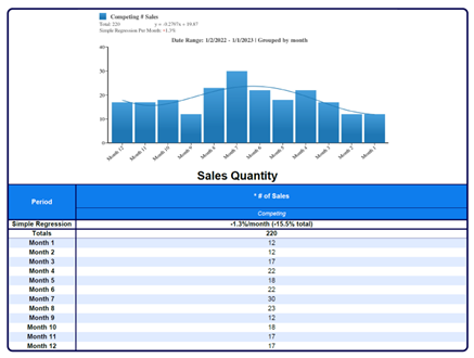
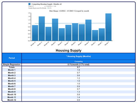
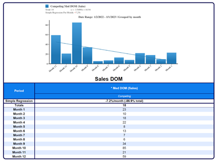
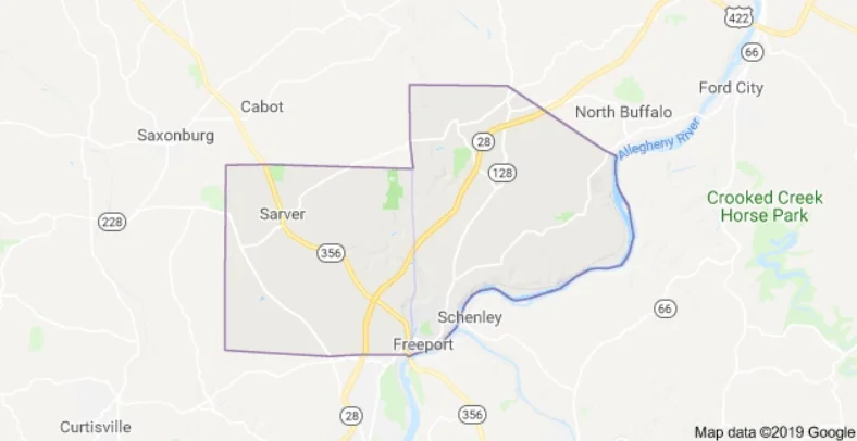
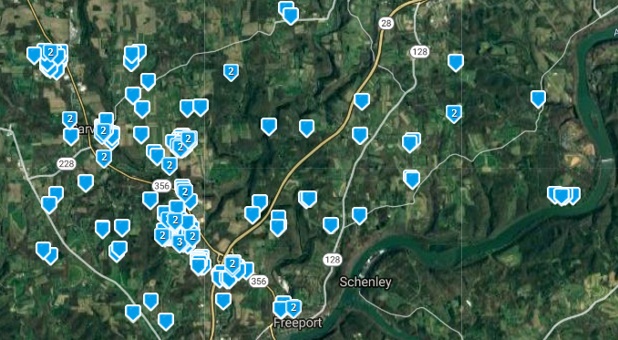
A note to begin: None of the above are singular market areas. In the two leftmost graphs are whole counties. They are placed together only because they have somewhat similar price ranges. Each of these areas has dozens of markets within them, and to represent the county trend as the market trend would be foolish. On every report that we produce we analyze the micro market of the subject and the surrounding competing markets when needed. However, to do this for a blog like this, would be to time intensive.

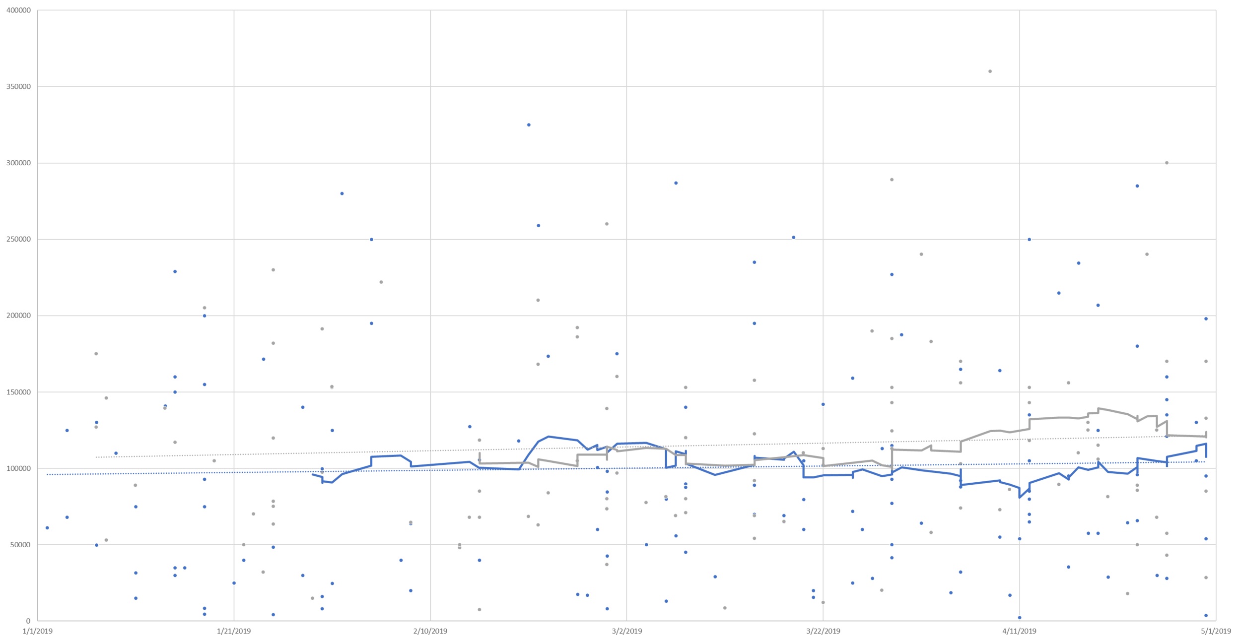
First up, let's look at Armstrong and Indiana Counties above (Armstrong: Blue / Indiana: Grey / 30 Day moving averages). These are both rural counties with some pockets of built-up areas (Indiana Borough, Kittanning, Homer City, Blairsville, Ford City, etc). Armstrong County as a whole has experienced typical seasonality, with a lower number of homes in the winter selling for slightly lower than the median prices would typically indicate, and a rebound towards the mean as we move into the late spring and the market begins to heat up. Indiana County, however, continues to struggle with low demand and a faltering median home price. While Indiana began to redound from typical seasonality, the month of April saw yet another decline. This is consistent with a now 2-year decline in home values in Indiana County. Leading this trend are the rural areas of the county, however, even White Township (the area just outside of Indiana Borough) has even recently begun to show signs of decline. Homer-Center School District is showing declines of as much as 7.5% per year, however, even the higher end homes of White Township are now showing a decline of 1.5% per year. Listing prices in Indiana County have begun to be in step with this (whereas a year ago they were increasing as prices were falling) however the degree to which listing prices are decreasing is lagging market prices similar to before. Overall, Armstrong County has a generally stable market, while Indiana County has weakening marketability (in part due to the past reassessment, more recent job closures, the declining population of IUP). While White Township had previously appeared to be resistant to this decline, it now appears to be moving with the county overall. It is possible that in the next year this trend could spill into the one area that has been resistant to the trend thus far: Indiana Borough.

In the year ending April 30, 2019, there were 451 sales in Armstrong County, while there are 227 homes currently on the market (Absorption rate of .166), indicative of a balance for the county which would likely indicate a continuing stable market. In the year ending April 30, 2019, there were 441 sales in Indiana County, while there are 384 homes currently on the market (Absorption rate of .096), indicative of an oversupply for the county which could continue to put downward pressure on home prices.

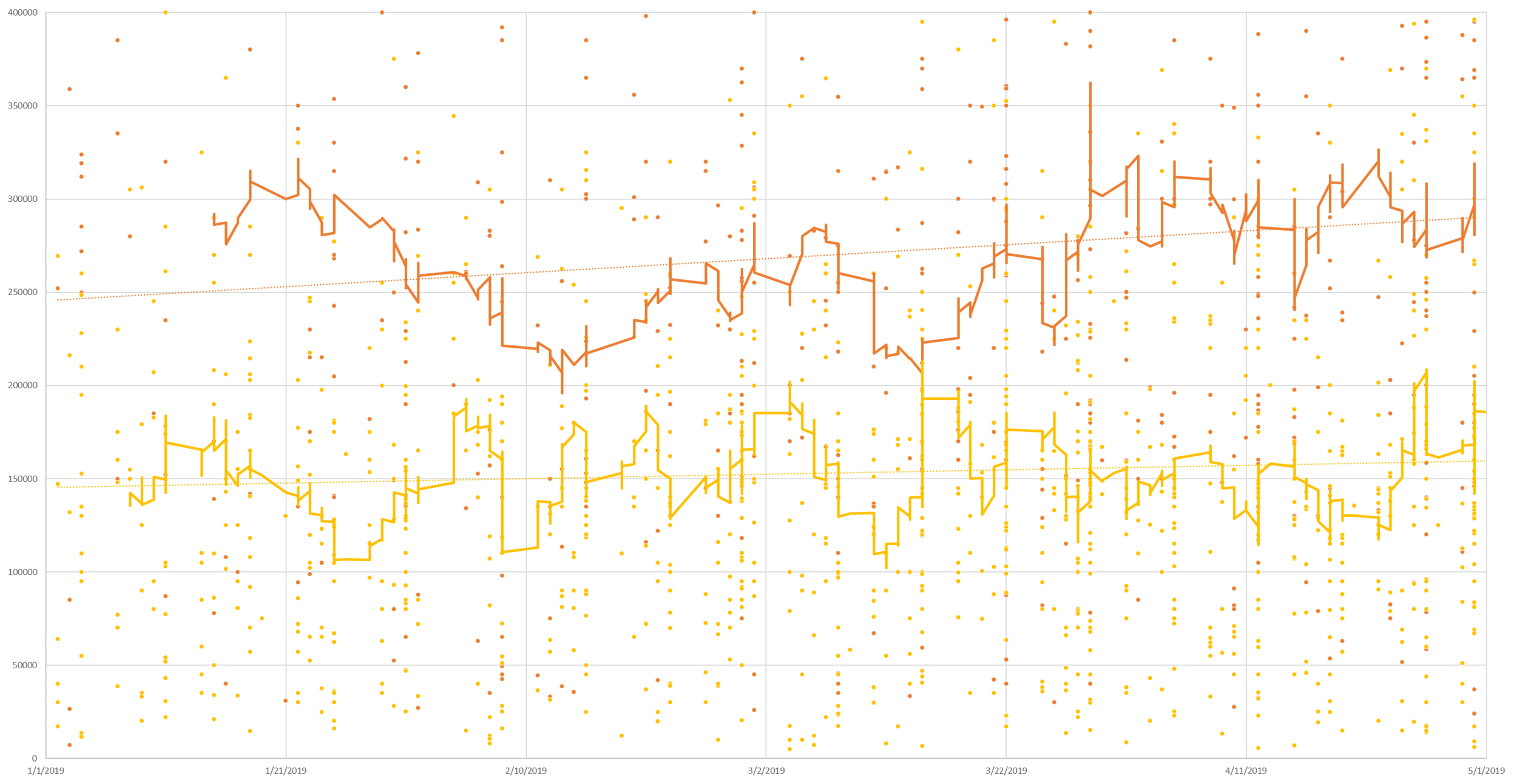
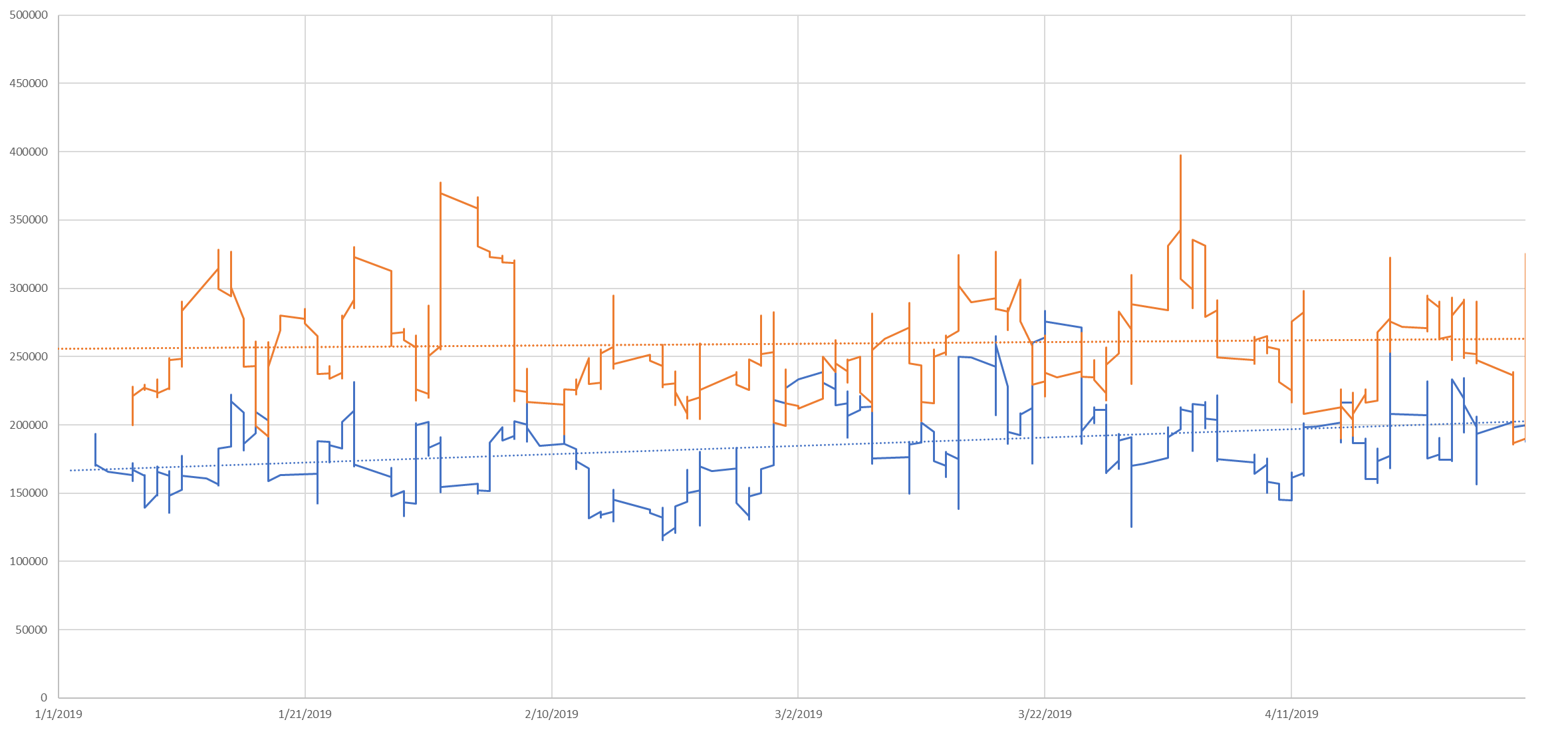
Next up, Butler and Westmoreland County above (Butler: Orange / Westmoreland: Yellow / 30 Day moving averages). These counties have mixtures of rural (Derry Twp and Karns City area for example) as well as very dense population centers nearer to the city (Cranberry Twp and Murrysville - not saying these are comparable, just having some similarity of density. Cranberry has experienced rapid growth in the last 15 years, which is in part reason for the higher sales prices) with wide ranges of appeal between them. Again, both are moving higher after seasonal softening in the winter months, however, Butler County with more sales is advancing more rapidly. Butler County has moved in a relatively steady direction from the winter lows, however, Westmoreland County appears to have had a week late March into early April. Reasons for this trend in relation to their neighbor Butler aren’t immediately apparent, but it is worth observing.

In the year ending April 30, 2019, there were 2,131 sales in Butler County, while there are 1,038 homes currently on the market (absorption rate of .171), indicative of a market in balance. In the year ending April 30, 2019, there were 3,768 sales in Westmoreland County, while there are 1,729 homes currently on the market (absorption rate of .182), indicative of a market in balance, or with a very slight undersupply.

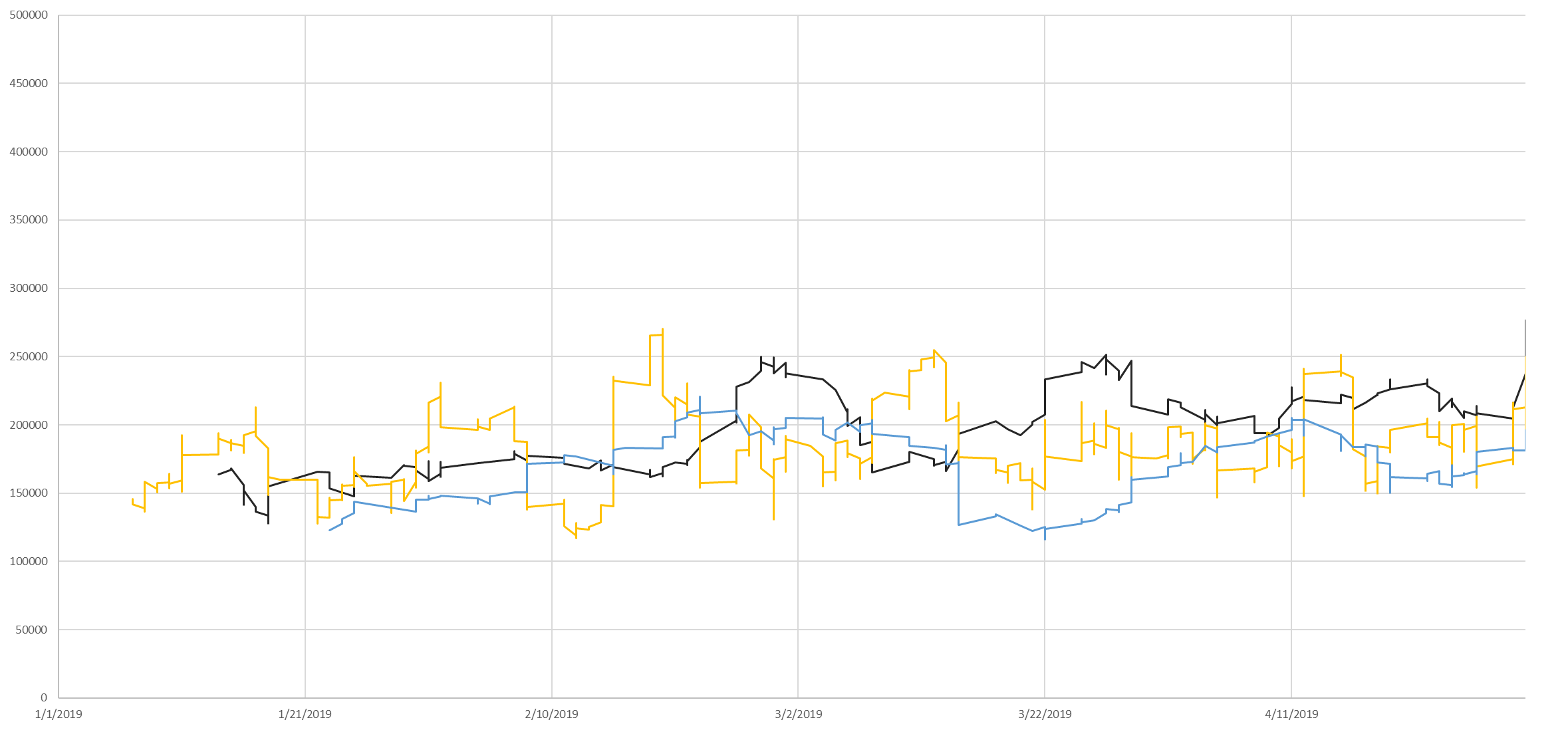
Finally, the right two graphs are the 5 divisions of Allegheny County. These areas are highly complex, with massive differences in market areas even within these five divisions. Here we’ll offer the Absorption rate and linear regression analysis for the year ending on April 30, 2019, with current market data for listings.

Allegheny East (Dark blue line above) had 4,289 sales in the last year with a total of 2,050 properties currently on the market (Absorption rate of .174), indicating that supply and demand are in balance. It started as the second highest median sales price area and ended the third highest. This was the third fastest growing area of the five for that time period.

Allegheny North (Orange line above) had 4,246 sales in the last year with a total of 1,687 properties currently on the market (Absorption rate of .210), indicating that there may be an undersupply. This started and ended the first four months with the highest median sale price and had the slowest appreciation of the five areas.

Allegheny Northwest (Black line above) had 1,259 sales in the last year with a total of 472 properties currently on the market (Absorption rate of .222), indicating that there may be an undersupply. It started as the 4th highest median sales price of the four and ended the first four months as the second highest median sales price. This was the fastest growing median sales price of the five areas for the first four months of this year.

Allegheny South (Yellow line above) had 4,264 sales in the last year with a total of 1,492 properties currently on the market (Absorption rate of .238), indicating that there may be an undersupply. It started as the third highest median sales price area and ended the fourth highest. This was the fourth fastest growing area of the five for that time period.

Allegheny West (Light blue line above) had 937 sales in the last year with a total of 330 properties currently on the market (Absorption rate of .237), indicating that there may be an undersupply. This started and ended the first four months with the lowest median sales prices. This was the second fastest appreciating market over this period.

This data is isolated to the first four months of the year, coming off of the lows of mid-winter. Attempting to extrapolate this to an annual trend would result in enormous errors. Every one of the above areas for the year ending on April 30, 2019, …

This data is isolated to the first four months of the year, coming off of the lows of mid-winter. Attempting to extrapolate this to an annual trend would result in enormous errors. Every one of the above areas for the year ending on April 30, 2019, experienced declining median sales prices and an increase in DOM over that time. The increases of the last 4 months have largely been seasonal, and in all cases have not corrected for the decline of 2018 (gray bars). Absorption rates above .20 traditionally indicate a sellers market, while absorption rates below .15 tend to indicate a buyers market. As you can see, Indiana is firmly in buyers market territory, while all but Allegheny East , in Allegheny County are in various states of buyers markets.

Why the decline? On the macro scale: Days On Market trending upward would indicate that homes on the market are higher than the buyer pool has a tolerance for generally - and that isn’t just a Pittsburgh issue, that was the story of the real estate market across the United States in 2018. The new generation (Millennials) coming into the home ownership age bracket has more debt than any generation before due to climbing education costs and falling wages when adjusted for inflation. Paired with the fact that the Baby Boomers are rapidly approaching the median life expectancy (2025), unless something unforeseen changes, this will likely mean a few years of slower than typical growth - or possible decline, as demand stays lower than typical and supply increases. Climbing interest rates in Q4 additionally put downward pressure on the real estate market across the US. Current forecasts indicate an increase of .25% over the summer off of their current 14 month low (note: an increase of .50% in the fall was paired with one of the slowest real estate markets in a decade).

On the micro scale: We expressed the reasons we believe for Indiana County above. The remaining counties have higher proximity to Pittsburgh and late 2018 saw the finalizing of the Amazon plans to build elsewhere, this may have deflated a small speculation bubble around hopes of development. We’re hopeful that a new distribution facility in Indiana County will provide some relief to the market. We also realize that there are very HOT markets in the midst of some of these declines, however, this is a bird's eye view of the region. Our area continues to move forward, navigating the transition from old industrial towns to what we are becoming. Leadership, investment, job opportunities, and creative thinking will be necessary to be successful.

Disclaimer: These graphs and analysis are based on all data available in these markets, REO, estate sales, distressed sales, and others. Micro-market trends can have huge impacts on prices, and these trends should not be extrapolated to all markets within these counties. Appraisals take as primary the immediate market area of those subject properties, and analyze differences of marketability that can change over the course of a tenth of a mile - much more those than can change from one end of a county to another.

Fun Fact: What are those hard vertical lines? Those are agents not doing closings on weekends (pushing extra data into the other 5 days, and gaps appearing weekly around weekends - good for you guys keeping your families first in the real estate race!

2008 vs. 2020: What can we learn from the past to protect our future?

What does the housing market have to do with plot of the movie "The Producers?"

What does the housing market have to do with plot of the movie "The Producers?"

One of the lies that was told during/after the housing crisis of 2008 is that "No one saw it coming!" However, some did, and warned the world loudly. Many in the financial markets knew and made billions. In the coming weeks we will look at the macro housing market, by looking back, and looking at lessons that we can learn. Now 10 years later, real estate professionals nationwide are warning that the lessons we learned in 2008 are being forgotten, and that the odds of another financial collapse are rising, and estimated by the majority by Q1 2020.

A number of great reporters have done an amazing job at presenting this information to the public over the past 10 years. We encourage you to take a listen/read/watch at this compilation of how the housing market of the United States brought the world to its knees, in hopes that we can avoid another collapse. When banks are allowed to bet against homeowners... its a recipe for disaster. With mortgage fraud on the rise and the legislation (Dodd Frank) that aimed to restrict this behavior targeted for repeal, you have to ask why?

A deep look at the 2008 crisis: https://www.thisamericanlife.org/405/inside-job

Two former Fed Chairmen predict a crash in 2020:  https://www.forbes.com/sites/lawrencelight/2018/07/31/4-financial-savants-warn-about-the-great-crash-of-2020/#2de307cc6197

Mortgage fraud on the rise:
https://www.housingwire.com/articles/46820-corelogic-mortgage-fraud-risk-spiked-in-the-second-quarter?utm_source=dlvr.it&utm_medium=twitter&utm_campaign=housingwire

Promises of Dodd Frank repeal continue:  https://www.cnbc.com/2018/05/24/trump-signs-bank-bill-rolling-back-some-dodd-frank-regulations.html