Some market areas are easier to analyze than others. A market area can be as small and contained as a single condominium plan. Other times, they have very irregular features. Today we’ll use the Freeport School District as an example, an area that covers areas in 2 counties, and at least 3 very distinct market areas. In addition to this being an analysis of a market area, this will also serve as a short example of some of the more simple steps that appraisers use in developing opinions of market areas, differing marketability, and comparable selection pools.
First we will start with a marked map of the school district.
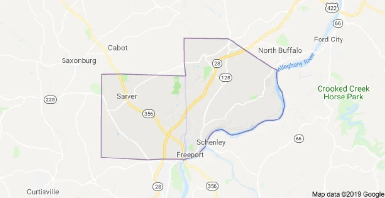
Here we see the outline of the Freeport SD, with an approximate border of the Butler/Armstrong County line, with Butler County being to the left and Armstrong County being to the right.

This is a map of the sales in the Freeport School District over the last 3 years (from 04/30/2019). A quick glance shows that the supply and demand dynamics. There is a dramatic increase of sales in Butler County vs. Armstrong.

When we look at sales over all time, this trend becomes even more obvious.
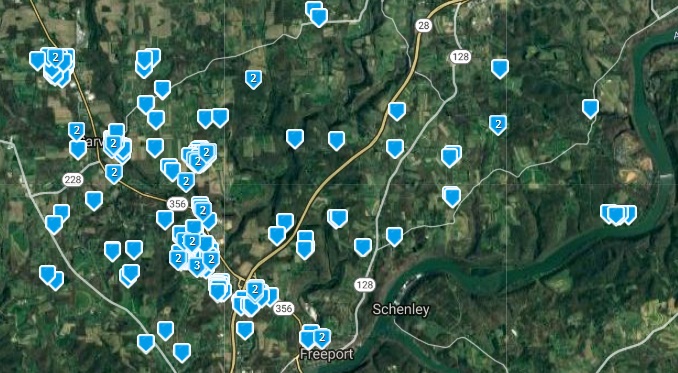
If we apply a price limiter ($300,000+) to evaluate the marketability difference, we see an even more exaggerated difference. This shows that of the total 223 sales in all of the recorded MLS, 199 sales have been in the Butler County Area, while only 24 have been in the Armstrong County side (830% more). These kind of findings demand that we analyze if these two markets, serviced by the same school districts, are comparable.
Med Sale Price Med Taxes Med Tax Ratio Med Lot Med Year Built
Freeport Borough $60,000 $1,540 .026 City 1932
Armstrong County $139,900 $2,204 .016 1.66 1984
Butler County $183,500 $2,316 .013 .87 2001
Why are 400 homes scheduled to be constructed in Butler County when there are still unsold lots? Why have lots sat unsold in Armstrong County for a decade? The numbers tell us that there is a dramatic marketable difference between the two areas. Why do Freeport homes sell for so little? In part, because they are much older than the competing offerings and suffer a tax ratio of double that of the competition. The areas located in Butler County has easier access to the amenities of the 28 corridor leading in to Pittsburgh and Route 356 leading to Butler, lower relative taxes, the same great school system (ranked 79th in the state, and much higher than the neighboring districts) and buyers have been willing to pay a premium for this.
In addition to these basic tools, we also use pivot chart analysis, regression analysis and moving averages to determine if competing market areas are comparable, but that is for another time.
Are similar properties across this invisible county line comparable? Yes and no. They can be comparable, however, the market appeal of living in this superior market area of Butler County has to be reflected in the analysis in attempting to compare properties. Whenever comparable sales are available within the same area, it would be misleading to go into the adjoining area. We hope that this simple breakdown helps agents understand differences in market areas and how to better select comparable sales for their clients to consider.