
Why a third and not a quarter? Many of the markets that we cover in this report have limited data, which makes analysis difficult, yet we wanted to be able to provide some level of seasonal analysis. Quarter’s would be ideal, however, by extending the data to four months instead of three we gain 33% more data, and therefore more able to make reliable statements. It's odd, we know, but hopefully you find it helpful.
Before we dive into our regional analysis, we want to take a look for a moment at the national trends. While Western PA proved rather resilient to the last housing bubble (because there wasn’t a high degree of speculation, to begin with) these trends can have wide-reaching effects.

This shows the trend of the median sale price increase (orange) compared to the median increase in building costs since 1990. The past 6 quarters have shown a weakening in the housing market, and some declines. It remains to be seen whether this will be a short-lived flattening of returns (similar to the early 1990s, and displayed by the extrapolated green line above) or a pullback towards builder cost trends similar to 2008 (extrapolated by the red line above).

This is the trend line of the entire West Penn Multi List since 2006 (sadly the data available gets increasingly unreliable further back in time) compared to national builder trends. We see a similar divergence in the local data from the trend that is seen in the national data, and a similar pullback in 2008. The good news: if the national trend remains flat, our local market will likely see little impact. If the national trend moves downward, like in 2008, our declines will likely be far shorter and less deep (again, because prices have not been inflated by speculation).
As the chart above shows, our real estate market is highly seasonal, with fall and winter prices falling and spring-summer months increasing. Last third, this stayed true with increasing prices, but a year over year (YOY) decline. This third showed most markets reversing the YOY trend to increase this year, and mix of trends over the term.

Allegheny East - with 1693 sales, showed signs of increased absorption, declining days on market, YOY increase in the median sale price, and an increasing price over the past four months, all consistent with a strong seller's market and increasing home values. This is consistent with the first four months of the year (with the exception that that term showed housing prices decline YOY). The only concerning data point here is an expired listing ratio of above 25%. This could indicate that over 25% of the market is currently so overpriced as to never consummate a sale.
Allegheny North - with 1761 sales, showed signs of increased absorption, declining days on market, YOY increase in median sale price. However, over the four-month term, the median price of homes fell. Yet, the absorption rate remains firmly within the seller’s market territory.
Allegheny West/North West - with 892 sales, these regions showed signs of increased absorption, declining days on market, YOY increase in median sale price. However, over the four-month term, the median price of homes fell. This market had shown the highest median sale price increase for the first 4 months of the year by nearly 200%. This fall may be a reaction to an over appreciation in the first four months of the year. This market had the strongest absorption rate for the term of the 8 areas studied.
Allegheny South - with 1679 sales, showed signs of increased absorption, YOY increase in the median sale price, and an increasing price over the past four months. However, the market did see increasing days on market and very weak growth of .002% for the term. Still, the absorption rate falls firmly within the seller’s market territory.
Armstrong - only experienced 157 sales over the last 4 months, consistent with last year, but limiting the accuracy with which statements can be made. Over the term, YOY market price and days on market fell. However, over the term market prices rose and absorption rates stayed in the seller’s market territory. However, with over 30% of listings expiring, this is indicative that nearly one-third of the market is so overpriced as to never attract offers.
Butler - with 974 sales, showed signs of increased absorption and declining days on market. However, home prices year over year (+.002%) and over the 4-month term (+.009%) remained nearly flat. Still, absorption rates remain in the seller’s market territory.
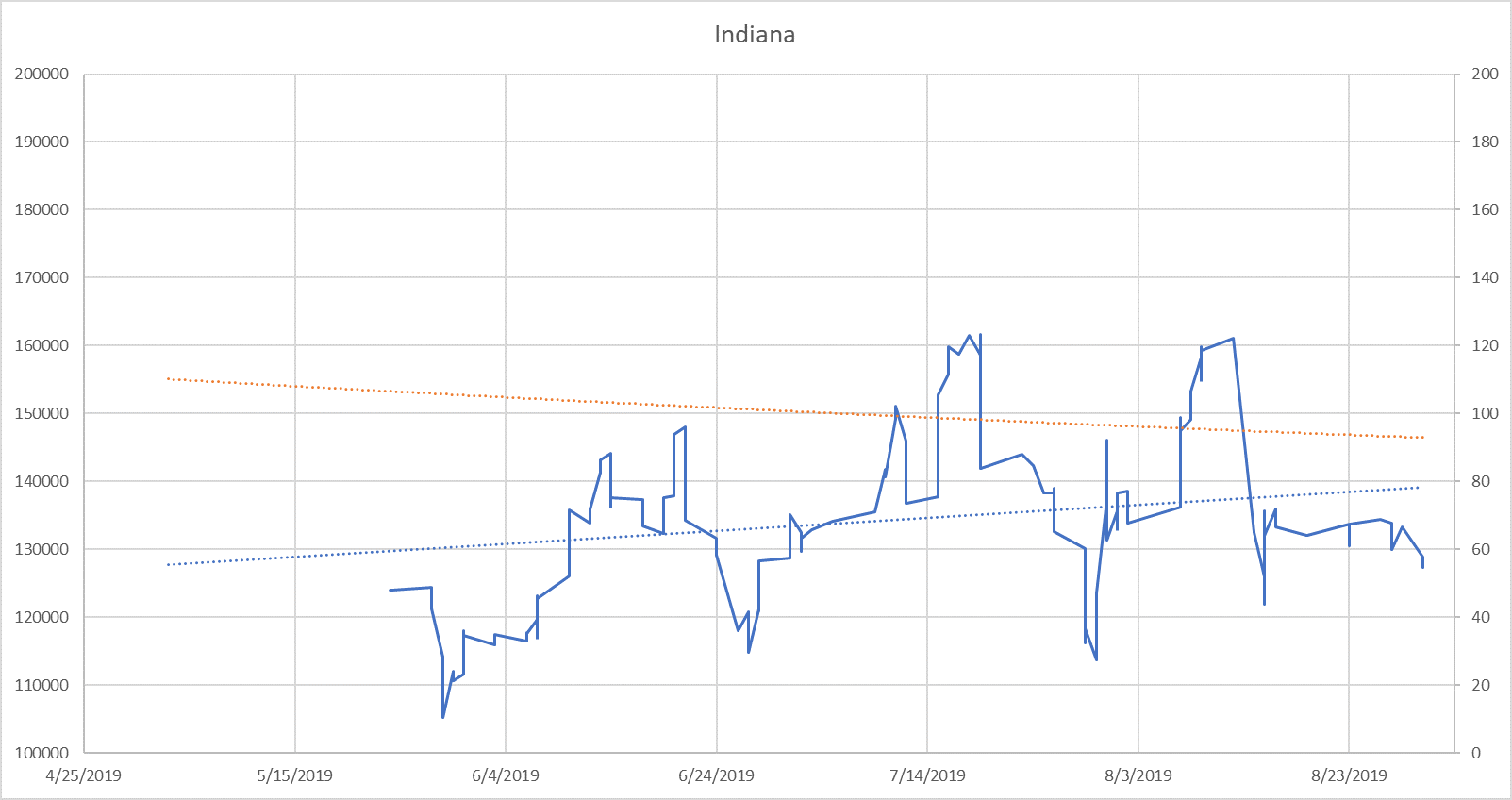
Indiana - only experienced 192 sales over the last 4 months, consistent with last year, but limiting the accuracy with which statements can be made. For the last 8 months, Indiana county has shown an increase in median sale prices. Could this finally be the bottom for this market that has been hammered for the past 4 years? With an expired ratio of nearly 35% for the term, there are still a large number of homes that are dramatically overpriced, however, the absorption rate is far increased (from .096 to .184) and is out of buyer’s market territory and moving nearer to seller’s market territory. If Indiana can manage a strong Fall, we may be seeing the bottom.
Westmoreland - with 1442 sales, showed signs of increased absorption, declining days on market, YOY increase in the median sale price, and an increasing price over the past four months, all consistent with a strong seller's market and increasing home values. This is consistent with the first four months of the year (with the exception that that term showed housing prices decline YOY). The only concerning data point here is an expired listing ratio of 25%. This could indicate that 25% of the market is currently so overpriced as to never consummate a sale.

Blue: 30 day moving average (line) with linear regression line (dotted)
Orange: 2 order polynomial regression of median days on market

Blue: 30 day moving average (line) with linear regression line (dotted)
Orange: 2 order polynomial regression of median days on market

Blue: 30 day moving average (line) with linear regression line (dotted)
Orange: 2 order polynomial regression of median days on market

Blue: 30 day moving average (line) with linear regression line (dotted)
Orange: 2 order polynomial regression of median days on market

Blue: 30 day moving average (line) with linear regression line (dotted)
Orange: 2 order polynomial regression of median days on market

Blue: 30 day moving average (line) with linear regression line (dotted)
Orange: 2 order polynomial regression of median days on market
Blue: 30 day moving average (line) with linear regression line (dotted)
Orange: 2 order polynomial regression of median days on market

Blue: 30 day moving average (line) with linear regression line (dotted)
Orange: 2 order polynomial regression of median days on market
What analysis do you want to see included in future? Leave a comment below.